Zanky: A Playful Display Font for Bold Digital Branding
As a UI designer who ships landing pages, SaaS dashboards, and e-commerce experiences, I reach for display fonts like Zanky when the goal is unmistakable personality—not just decoration. It’s not a workhorse body typeface. It’s a deliberate, expressive tool: a display font built for impact, rhythm, and tonal clarity in digital interfaces.
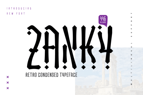
Zanky stands out with its intentionally irregular shapes—slightly uneven baselines, asymmetric curves, and unexpected stroke endings. These aren’t flaws; they’re design decisions that lend warmth and human energy. Unlike rigid geometric sans serifs or overly polished script fonts, Zanky feels hand-guided but digitally precise—ideal for brands that want to signal creativity, approachability, or joyful confidence without sacrificing polish.
In practice, Zanky excels where attention must be earned quickly: hero section headlines, product launch banners, course title cards, and CTA buttons on high-conversion landing pages. Its visual weight and character make it instantly scannable—even at smaller sizes on mobile, as long as you keep usage tight. I’ve used it for boutique online store banners (e.g., “Summer Drop Is Live!”), coaching site headers (“Your Clarity Starts Here”), and portfolio project titles—always paired with a neutral, highly legible sans serif like Inter or Manrope for body text and navigation.
Readability isn’t about universal coverage—it’s about context-aware application. Zanky works best for short, high-impact phrases: under 6 words in most cases. Avoid using it for paragraph text, form labels, or small interface elements like tab titles or tooltip copy. On dark backgrounds, its contrast holds well—but test letter spacing at 24px+ to prevent visual crowding. Over image overlays, use subtle text shadows or solid background bars to ensure legibility across devices.
Visual hierarchy benefits directly from Zanky’s distinct silhouette. When layered above clean body type, it creates an immediate focal point—guiding the eye before the user even reads a word. That’s why it shines in conversion-focused layouts: a Zanky headline paired with a bold sans-serif subhead and minimalist button creates a clear, emotionally resonant information cascade. Users don’t just see content—they feel tone first, then absorb meaning.
Brand tone is where Zanky truly differentiates. It conveys playfulness without immaturity, uniqueness without obscurity. For creative entrepreneurs, indie makers, and wellness or education brands, it signals authenticity and intentionality—not trend-chasing. A fintech dashboard? Probably not. A children’s learning app, an artisanal skincare shop, or a design-focused newsletter? Absolutely. The font quietly reinforces brand identity by aligning visual language with voice.
Font pairing is non-negotiable with display fonts like Zanky. I default to sans serif pairings for digital interfaces—Inter, Poppins, or even system fonts like -apple-system—for their neutrality, performance, and responsive behavior. For editorial or brand-kit contexts, a restrained serif like Lora or Source Serif Pro adds sophistication without competing. Never pair Zanky with another decorative or script font—the contrast collapses into noise.
Zanky ships with standard OpenType features and supports Latin-based languages. Webfont versions are available in WOFF2 format, optimized for fast loading and broad browser support. Check for stylistic alternates if your project needs subtle variation—like a more condensed version for narrow banner spaces or alternate glyphs for repeated letters. No variable weight axis, so plan hierarchy using size, color, and spacing—not boldness shifts.
Licensing matters—especially for client work and commercial products. Zanky is a commercial font, meaning you’ll need a license that covers web embedding (e.g., via @font-face), digital templates, and resale assets like Notion brand kits or Figma UI libraries. Most licenses include unlimited pageviews for websites and SaaS apps, but always verify terms for e-commerce platforms, white-labeled tools, or downloadable design assets. Using it unlicensed—even on a personal portfolio—risks legal exposure and undermines the craft of type design.
I reach for Zanky when the brief calls for memorable, human-centered distinction—not just “something fun.” It performs reliably in real-world constraints: responsive breakpoints, CMS-driven content sections, dark-mode toggles, and fast-loading mobile experiences. Used thoughtfully, it strengthens consistency across touchpoints—from email headers and social media graphics to product packaging mockups and digital ad creatives.
It’s also surprisingly versatile in supporting roles. Try Zanky for decorative accents: single-word section dividers (“Explore”, “Join”, “Launch”), icon labels in dashboard widgets, or animated headline reveals on scroll. In blog graphics or course module cards, it adds visual punctuation without overwhelming. Just remember: restraint amplifies impact. One Zanky headline per screen is often enough.
Ultimately, Zanky isn’t about being everywhere—it’s about being unforgettable where it counts. It supports digital readability not through neutrality, but through confident, intentional contrast. It builds brand trust by aligning aesthetic choices with authentic voice. And it helps designers create experiences where users don’t just navigate—they connect.
If your next project needs a spark of character that still respects usability, accessibility, and performance—Zanky earns its place in your design assets. Just pair it wisely, license it properly, and let it do what it does best: make your digital identity feel unmistakably, joyfully yours.